
Tableau Training Course In Dehradun
Mode : hybrid
duration: 1.5 Months

Data Science Online Course
Mode : hybrid
duration: 6 months

Data Analytics Online Course
Mode : hybrid
duration: 6 months

R Programming Course
Mode : hybrid
duration: 1.5 Months

Python Course in Dehradun
Mode : hybrid
duration: 3 Months

Advance Excel Course In Dehradun
Mode : hybrid
duration: 1.5 Months

Data Analytics Course In Dehradun
Mode : hybrid
duration: 6 months

Data science course in Dehradun
Mode : hybrid
duration: 6 months
Data Science Course in Delhi
Mode : hybrid
duration: 6 months

CCNA Training Course
Mode : hybrid
duration: 1.5 Months

Machine Learning Course in Dehradun
Mode : hybrid
duration: 3.5 Months

Machine Learning Course In Delhi
Mode : hybrid
duration: 3.5 Months

Artificial Intelligence Course In Dehradun
Mode : hybrid
duration: 3 Months

Data Analytics Course in Delhi
Mode : hybrid
duration: 6 months

Machine Learning Online Course
Mode : hybrid
duration: 3.5 Months

Azure Training Course In Dehradun
Mode : hybrid
duration: 3 Months

Artificial Intelligence Online Course
Mode : hybrid
duration: 3 Months

Full Stack Web Development Course In Dehradun
Mode : hybrid
duration: 6 months

Full Stack Web Development Course
Mode : hybrid
duration: 6 months

Cyber Security Course
Mode : hybrid
duration: 2 months

Cyber Security Course In Dehradun
Mode : hybrid
duration: 2 Months
Full Stack Web Development Course In Delhi
Mode : hybrid
duration: 6 Months

Tableau Online Course
Mode : hybrid
duration: 1.5 Months

Digital Marketing Course
Mode : hybrid
duration: 3 Months

Digital Marketing Course In Dehradun
Mode : hybrid
duration: 3 Months

Power BI Online Course
Mode : hybrid
duration: 2 Months
Data Science Python Online Course
Mode : hybrid
duration: 3 Months

Artificial Intelligence Course In Delhi
Mode : hybrid
duration: 3 Months

Python Course In Delhi
Mode : hybrid
duration: 3 Months

Front End Web Development Course In Dehradun
Mode : hybrid
duration: 3 Months

Backend Web Development Course In Dehradun
Mode : hybrid
duration: 2.5 Months

Microsoft Power BI Course In Dehradun
Mode : hybrid
duration: 2 months

Advance Excel Course In Delhi
Mode : hybrid
duration: 1.5 Months

Advance Excel course Online
Mode : hybrid
duration: 1.5 Months

AWS Certification Course
Mode : hybrid
duration: 1.5 Months

Front End Web Development Course
Mode : hybrid
duration: 3 Months

Backend Web Development Course
Mode : hybrid
duration: 2 Months

Python Online Course
Mode : hybrid
duration: 3 Months

AWS Solution Architect Course
Mode : hybrid
duration: 1.5 Months

AWS Solution Architect Course In Dehradun
Mode : hybrid
duration: 1.5 Months

Tableau Training Course In Delhi
Mode : hybrid
duration: 1.5 Months

Microsoft Power BI Course In Delhi
Mode : hybrid
duration: 2 Months

AWS SysOps Administrator Course
Mode : hybrid
duration: 1.5 Months

AWS Sysops Administrator Course In Dehradun
Mode : hybrid
duration: 1.5 Months

AWS Cloud Practitioner Certification Course
Mode : hybrid
duration: 1.5 Months

AWS Cloud Practitioner Certification In Dehradun
Mode : hybrid
duration: 1.5 Months

SAP HCM Course
Mode : hybrid
duration: 2 Months

SAP HCM Course In Dehradun
Mode : hybrid
duration: 2 Months

SAP HCM Course In Delhi & Noida
Mode : hybrid
duration: 2 Months

SAP MM Course
Mode : hybrid
duration: 2 Months

SAP MM Course In Dehradun
Mode : hybrid
duration: 2 Months

SAP MM Course In Delhi & Noida
Mode : hybrid
duration: 2 Months

SAP Successfactors Training
Mode : hybrid
duration: 2 months

SAP Successfactors Training In Delhi & Noida
Mode : hybrid
duration: 2 Months

SAP Successfactors Training in Dehradun
Mode : hybrid
duration: 1.5 Months

SAP FICO course
Mode : hybrid
duration: 2 months

SAP FICO course in Delhi
Mode : hybrid
duration: 2.5 Months

SAP FICO Training In Dehradun
Mode : hybrid
duration: 2 months

SAP ABAP Training
Mode : hybrid
duration: 2 Months

SAP ABAP Training In Delhi & Noida
Mode : hybrid
duration: 2 months

SAP ABAP Training In Dehradun
Mode : hybrid
duration: 2 Months

SAP PP Training
Mode : hybrid
duration: 2 Months

SAP PP Training In Delhi
Mode : hybrid
duration: 2 Months

SAP PP Training In Dehradun
Mode : hybrid
duration: 2 Months
ReactJS Course
Mode : hybrid
duration: 1.5 Months

ReactJS Course In Dehradun
Mode : hybrid
duration: 1.5 Months

ReactJS Course In Delhi
Mode : hybrid
duration: 1.5 Months

MongoDB Course
Mode : hybrid
duration: 1 Month

MongoDB Course In Dehradun
Mode : hybrid
duration: 1 Month

MongoDB Course In Delhi
Mode : hybrid
duration: 1 Month

Node Js Course
Mode : hybrid
duration: 1.5 Months

Django Course In Dehradun
Mode : hybrid
duration: 2 Months

Django Course
Mode : hybrid
duration: 2 Months

Node Js Training In Delhi
Mode : hybrid
duration: 1.5 Months

Django Course In Delhi
Mode : hybrid
duration: 2 Months

Node Js Training In Dehradun
Mode : hybrid
duration: 1.5 Months
Microsoft Azure Data Fundamentals Course (DP 900)
Mode : hybrid
duration: 1.5 Months

Microsoft Azure Data Fundamentals Course In Delhi
Mode : hybrid
duration: 1.5 Months

Microsoft Azure Data Fundamentals Course In Dehradun
Mode : hybrid
duration: 1.5 Months

Microsoft Azure AI Fundamentals Course
Mode : hybrid
duration: 1.5 Months

Microsoft Azure AI Fundamentals Course In Delhi
Mode : hybrid
duration: 1.5 Months

Microsoft Azure AI Fundamentals Course In Dehradun
Mode : hybrid
duration: 1.5 Months

Digital Marketing Summer Training In Dehradun
Mode : hybrid
duration: 4/6 Weeks

Digital Marketing Summer Training In Delhi
Mode : hybrid
duration: 4/6 Weeks

Data Analytics Summer Training In Delhi
Mode : hybrid
duration: 4/6 weeks

Full Stack Web Development Summer Training In Dehradun
Mode : hybrid
duration: 4/6 Weeks

Full Stack Web Development Summer Training In Delhi
Mode : hybrid
duration: 4/6 Weeks

Cyber Security Summer Training In Dehradun
Mode : hybrid
duration: 4/6 Weeks

Cyber Security Summer Training In Delhi
Mode : hybrid
duration: 4/6 Weeks

UI UX Design Course in Dehradun
Mode : hybrid
duration: 3 Months

Graphic Design Course in Dehradun
Mode : hybrid
duration: 2 months

Cloud Engineering Course
Mode : hybrid
duration: 6 months

Cloud Data Engineer Course in Dehradun
Mode : hybrid
duration: 6 months

Cloud Data Engineer course in Delhi & Noida
Mode : hybrid
duration: 6 months

UI UX Design Course in Delhi
Mode : hybrid
duration: 2.5 months

UI UX Design Course
Mode : hybrid
duration: 2.5 months

Data Analytics Summer Training In Dehradun
Mode : hybrid
duration: 4 to 6 week

Business Analyst Course in Dehradun
Mode : hybrid
duration: 6 months

Business Analyst Course in Delhi
Mode : hybrid
duration: 6 months

Data Science Online Course
Mode : hybrid
Duration : 6 months

Data Analytics Online Course
Mode : hybrid
Duration : 6 months

Full Stack Web Development Course
Mode : hybrid
Duration : 6 months

Cyber Security Course
Mode : hybrid
Duration : 2 months

Digital Marketing Course
Mode : hybrid
Duration : 3 Months

Cloud Engineering Course
Mode : hybrid
Duration : 6 months

UI UX Design Course
Mode : hybrid
Duration : 2.5 months
drop us a query
Created On 11/17/2023, 5:35:17 PM
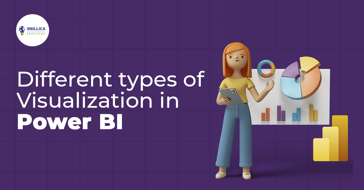

Power BI visualization types