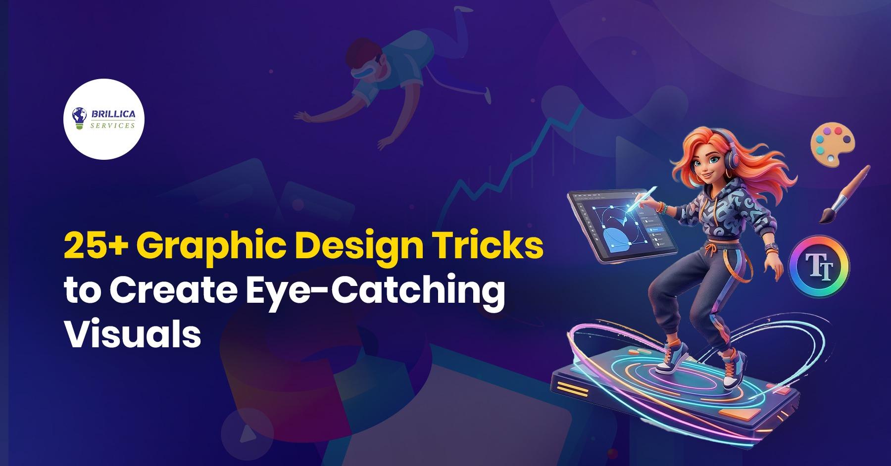
Introduction
If you want your designs to stand out, you need more than basic skills. You need smart Graphic Design Tricks that make your work look clean, modern, and professional. Whether you are a student, beginner, working professional, or planning a career switch, these simple tricks can help you create better visuals fast.
In this guide, you will learn powerful graphic design tips, graphic design hacks, and graphic design principles that are easy to follow and work in real projects.
The Essentials: Layout & Composition Tricks
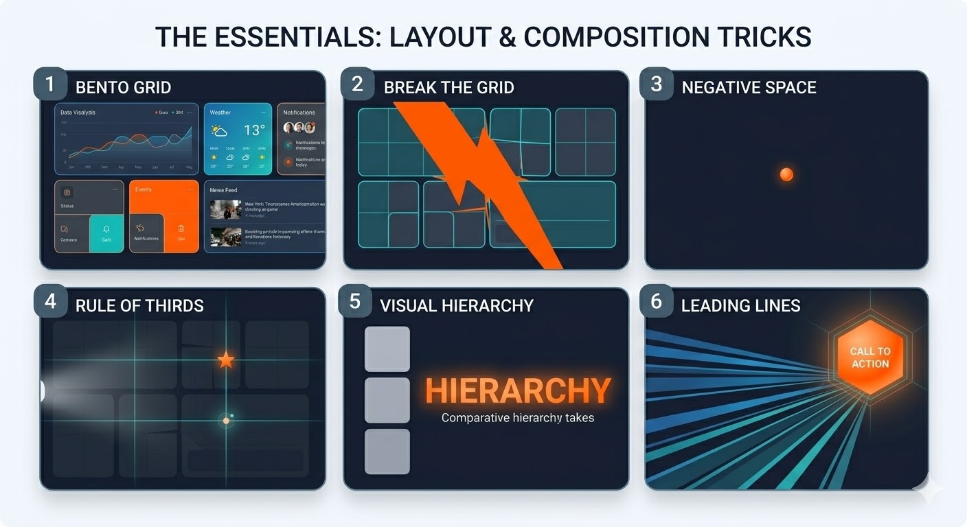
1. Use the Bento Box Grid
Divide your design into neat boxes with rounded corners. This style is trending and gives a clean look.
2. Break the Grid Smartly
After creating a structure, let one element go outside the grid. This adds energy and movement.
3. Use Negative Space
Empty space is not useless. It helps your main content stand out and makes designs easy to read.
4. Follow the Rule of Thirds
Divide your canvas into 3×3 sections. Place important elements on the intersections for better balance.
5. Create Visual Hierarchy
Make important elements bigger and bold. This guides the viewer’s eyes step by step.
6. Use Leading Lines
Use shapes or lines to direct attention toward your main message or CTA.
Typography Tricks for Better Designs
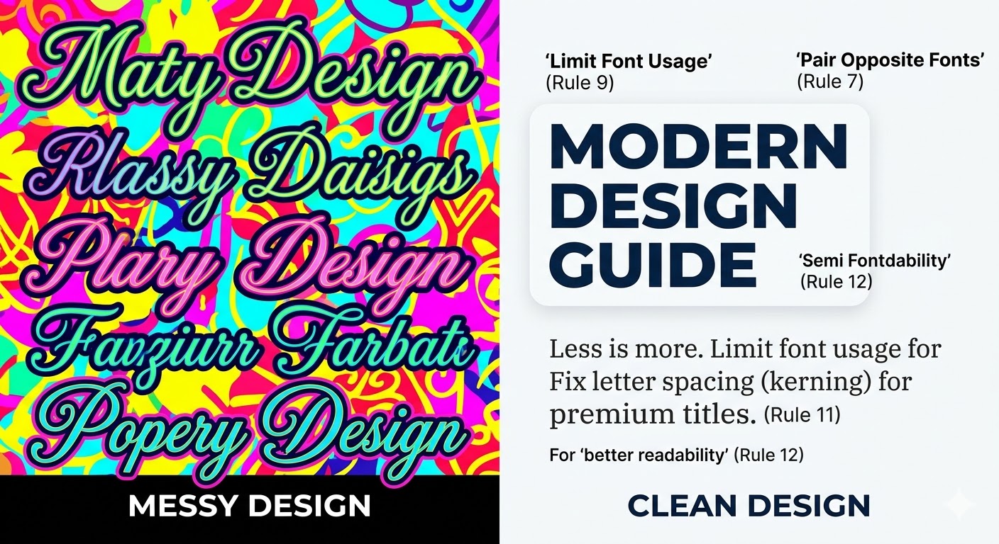
7. Pair Opposite Fonts
Mix a bold font with a simple one. This creates a strong and attractive look.
8. Try Liquid Typography
Stretch or warp text for creative headings. This is a popular graphic design trend.
9. Limit Font Usage
Use only 2–3 fonts. Too many fonts make designs look messy.
10. Match Font Colors
Pick colors from your background image for text. This creates harmony.
11. Adjust Letter Spacing
Fix spacing between letters to make titles look premium.
12. Use Text Background Shapes
If the background is busy, add a light shape behind text for better readability.
Color & Mood Tricks
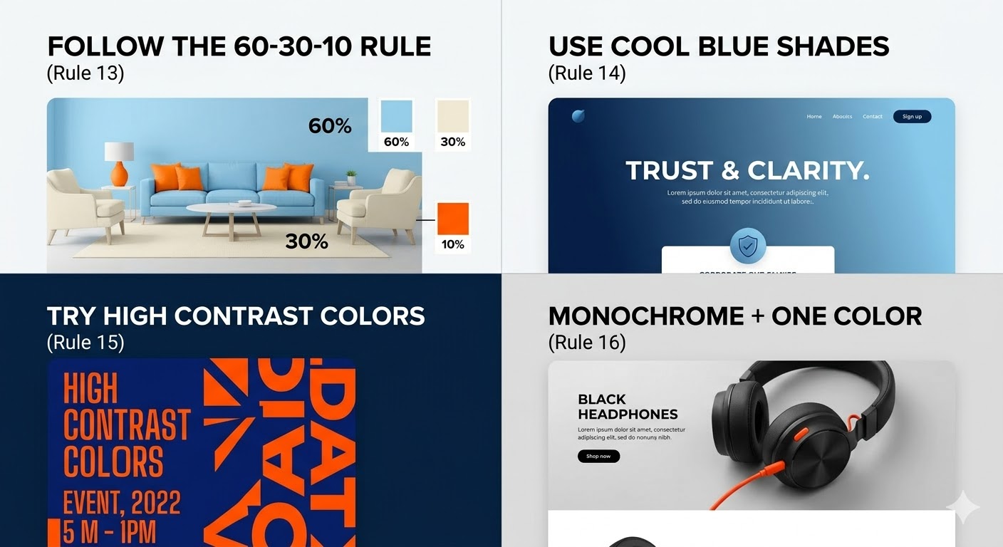
13. Follow the 60-30-10 Rule
Use 60% main color, 30% secondary color, and 10% highlight color.
14. Use Cool Blue Shades
Blue with white gives a clean and trustworthy look.
15. Try High Contrast Colors
Use opposite colors like blue and orange to grab attention.
16. Monochrome + One Color
Use black and white design with one bright color for focus.
17. Add Soft Gradients
Gradients give depth and make designs look modern.
Pro Graphic Design Hacks
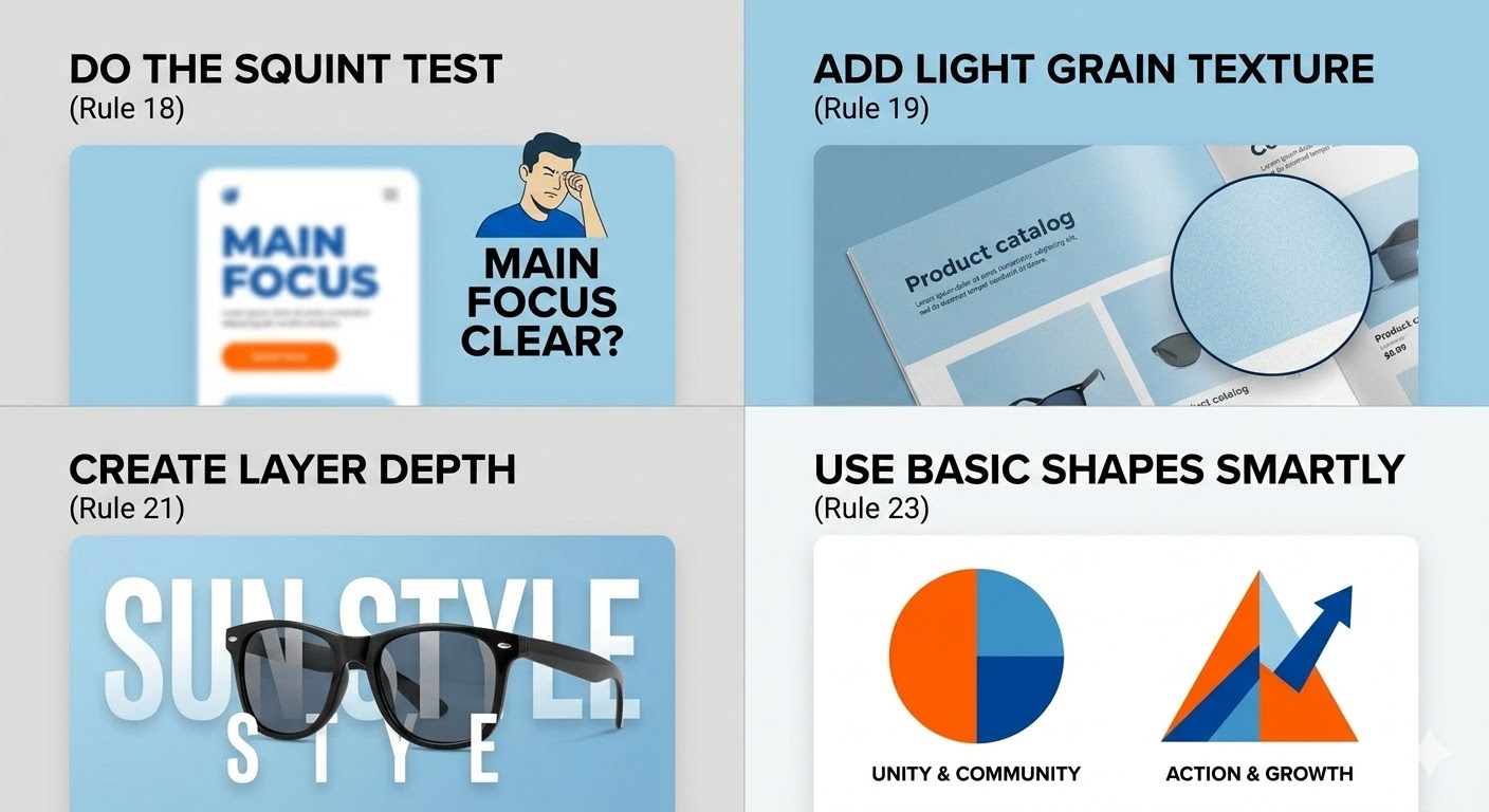
18. Do the Squint Test
Close your eyes slightly. If you can’t see the main focus, improve your layout.
19. Add Light Grain Texture
A small texture layer makes designs feel real and premium.
20. Use Ink Trap Fonts
These fonts look sharp and trendy on screens.
21. Create Layer Depth
Place text behind and in front of images to create a 3D feel.
22. Keep Shadows Consistent
All shadows should go in one direction for a natural look.
23. Use Basic Shapes Smartly
Circles show unity, triangles show action. Use shapes with meaning.
Advanced Graphic Design Tricks
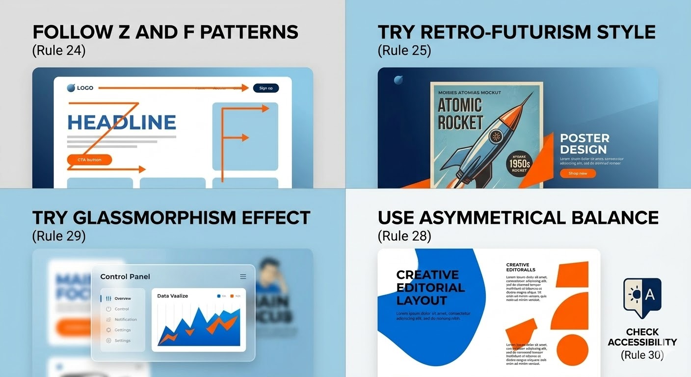
24. Follow Z and F Patterns
People scan screens in Z or F shape. Place important content in these areas.
25. Try Retro-Futurism Style
Mix old design styles with modern elements for a unique look.
26. Use Duotone Images
Convert images into two colors to match your brand style.
27. Add Micro-Animations
Small animations increase engagement in digital designs.
28. Use Asymmetrical Balance
Balance one big element with smaller elements for a creative layout.
29. Try Glassmorphism Effect
Use blurred background with light transparency for modern UI.
30. Check Accessibility
Make sure text is easy to read for everyone. Good contrast is important.
Benefits of Using These Graphic Design Tricks
Improves design quality
Makes visuals more engaging
Helps in branding
Saves time while designing
Increases user attention
Real-Life Example
Think about social media ads. Ads with clear layout, bold text, and strong colors always perform better. Brands use these graphic design hacks to increase clicks and sales.
FAQs
1. What are graphic design tricks?
Graphic design tricks are simple techniques that help improve design quality and make visuals more attractive.
2. How can beginners improve in graphic design?
Beginners should follow basic principles like layout, color, and typography and practice regularly.
3. Which is the best graphic design tip?
Using visual hierarchy is one of the best tips because it guides users clearly.
4. Why is color important in graphic design?
Colors create mood, attract attention, and improve user experience.
5. What are the latest graphic design trends?
Trends include liquid typography, gradients, glassmorphism, and retro-futurism.
Conclusion
Using the right Graphic Design Tricks can completely change your work. You don’t need to be an expert to create amazing visuals. Just follow these simple tips, practice daily, and keep learning new trends.
If you want to learn these skills step by step, Brillica Services provide graphic design course where you can learn real-world projects, modern tools, and industry-level techniques. This course is perfect for students, beginners, and professionals who want to build a strong career in graphic design.
Start learning today and create designs that truly stand out.