


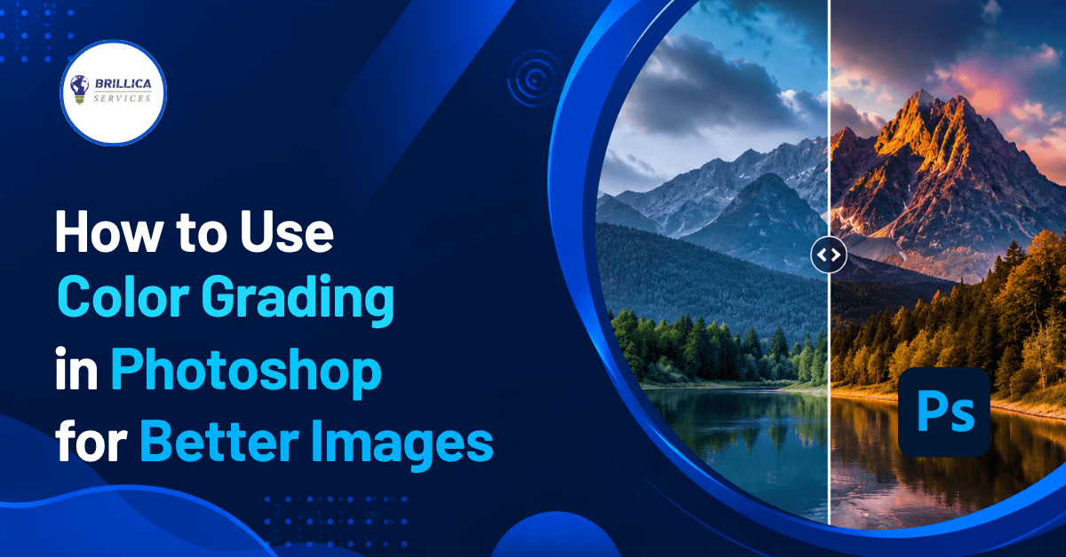
A good photo can look completely different with the right colors. If an image looks dull, flat, too warm, or lacks a clear mood, color grading in Photoshop can help you transform it. From simple social media photos to professional creative projects, the right color tones can make an image more attractive and easier to connect with.
In this color grading Photoshop tutorial, we will explain how to use different Photoshop tools to improve your images. You will learn how to use Color Lookup, Gradient Map, Curves, Color Balance, Hue/Saturation, Selective Color, and Camera Raw Filter. The guide is written for Photoshop color grading for beginners, but it also includes useful techniques for students, designers, photographers, and business owners.
What Is Color Grading in Photoshop?
Color grading in Photoshop is the process of changing and controlling the colors of an image to create a particular mood, style, or visual appearance. Instead of simply making a photo brighter or darker, color grading lets you decide how the shadows, highlights, and midtones should look.
For example, you can give a travel photograph a warm and sunny appearance, create a cool blue mood for a night scene, or use a combination of colors to create a cinematic look. This is different from basic Photoshop color correction, where the main goal is to fix problems such as incorrect white balance, poor exposure, or unwanted color casts.
A useful workflow is to correct the image first and then apply creative color grading. This helps you get cleaner and more natural results.
Color Correction vs Color Grading
Before learning how to use color grading in Photoshop, it is important to understand the difference between correction and grading.
Color correction focuses on making an image look accurate and balanced. You may adjust brightness, white balance, contrast, saturation, or skin tones to fix an image.
Color grading, on the other hand, focuses on creating a particular visual style. You might make shadows slightly blue and highlights warm to create a cinematic appearance.
Think of it this way:
Color correction fixes the image.
Color grading gives the image a style.
Both can be used together for professional photo editing.
Why Use Photoshop Color Grading?
There are several reasons designers and photographers use Photoshop color grading tools. First, color can change the mood of an image. Warm colors can create feelings of comfort, energy, or happiness, while cooler colors can create a calm, serious, or dramatic feeling.
Color grading can also help different images look consistent. This is useful when creating Instagram posts, website graphics, advertisements, portfolios, or a complete photography collection.
For businesses, consistent color tones can also support visual branding. A carefully chosen color style can make promotional images look more professional and recognizable.
How to Use Color Grading in Photoshop Step by Step
1. Open and Prepare Your Image
Start by opening your image in Adobe Photoshop. Before making major changes, create a duplicate of the original layer or convert it into a Smart Object.
Using adjustment layers is another good practice because they allow you to make changes without permanently changing the original image.
Take a moment to study the photo. Check its exposure, contrast, white balance, highlights, shadows, and existing colors. This basic review will help you decide what needs correction before you start creative photo color grading in Photoshop.
2. Correct the Image Before Grading
Good color grading starts with a good base image. Use tools such as Curves adjustment, Color Balance, Hue/Saturation, or Camera Raw Filter to correct basic problems.
For example, if the image is too yellow, reduce the unwanted warm tones. If the image is too dark, improve the exposure and shadows before applying a creative look.
Do not try to fix every problem with color grading. First create a balanced image, then build your desired style on top of it.
3. Use Color Lookup for Fast Color Grading
Color Lookup is one of the easiest ways to experiment with different color styles in Photoshop. It uses LUTs, or Look-Up Tables, to apply a predefined color transformation to an image.
To use it, create a Color Lookup adjustment layer and explore the available options. Different LUTs can produce different color tones and moods.
After selecting a look, reduce the layer's opacity if the effect is too strong. You can also use a layer mask to apply the effect only to selected parts of the image.
Learning how to use Color Lookup for color grading in Photoshop is especially useful for beginners because it allows you to quickly compare different styles.
4. Try Gradient Map for Creative Color Tones
A Gradient Map is another powerful option for image color grading. It maps different colors to the brightness levels of an image.
For example, you can assign a darker blue to the shadows and a warm orange to the highlights. This can create a strong cinematic effect.
To keep the result natural, lower the opacity of the Gradient Map layer or experiment with different blending modes. This is one of the most useful color grading techniques in Photoshop when you want more control over the overall mood.
5. Use Curves for Better Control
Curves adjustment gives you detailed control over brightness and color. You can use the RGB curve to adjust contrast or work with individual red, green, and blue channels to change the color balance.
A small adjustment can make a big difference. Avoid making extreme curve changes unless you are intentionally creating a dramatic effect.
Curves are particularly useful when you want to color grade images professionally because they provide more control than many one-click effects.
6. Adjust Colors with Color Balance
The Color Balance tool allows you to work with shadows, midtones, and highlights separately. This makes it useful for creating a balanced color style.
For example, you could add a little blue to the shadows and a small amount of yellow or red to the highlights. This warm-and-cool combination is often used to create a cinematic look.
The key is subtlety. Strong color changes can make a photograph look unnatural.
7. Use Hue/Saturation for Specific Colors
Hue/Saturation is useful when one particular color needs adjustment. You can change the hue, saturation, or brightness of individual colors without changing the entire image equally.
For example, if the green leaves in a photograph look too bright, you can target the green range and reduce its saturation.
This technique is helpful for Photoshop color editing, product photography, portraits, and social media graphics where specific colors need to match a design or brand style.
8. Try Selective Color for Detailed Adjustments
Selective Color gives you even more control over individual color groups. You can adjust colors such as reds, yellows, greens, cyans, blues, magentas, whites, neutrals, and blacks.
This makes it useful when you want to fine-tune the final result rather than apply a broad effect.
For example, you can slightly change the appearance of skin tones while keeping the background almost unchanged. This is one of the more advanced Photoshop color adjustment techniques.
How to Create Cinematic Color Grading in Photoshop
If you want to learn how to create cinematic color grading in Photoshop, start by thinking about the mood you want rather than copying a particular effect.
A common approach is to create cooler tones in darker areas and warmer tones in brighter areas. You can experiment with Color Balance, Curves, Gradient Map, or Color Lookup to achieve this effect.
However, cinematic color grading does not simply mean making everything blue and orange. Good grading also considers skin tones, contrast, brightness, saturation, and the colors already present in the scene.
The best results usually come from small adjustments made across several layers rather than one very strong filter.
Best Color Grading Techniques for Photoshop
Here are some practical tips to get better results:
Keep Adjustment Layers Separate
Use separate adjustment layers for different tasks. This makes your workflow easier to manage and allows you to change individual effects later.
Use Layer Masks
Layer masks let you control where an adjustment appears. You can grade the background without heavily affecting a person's face, for example.
Avoid Over-Saturation
More saturation does not always mean better colors. Excessive saturation can remove detail and make photos look artificial.
Protect Natural Skin Tones
When editing portraits, pay special attention to skin. A creative color grade should support the subject rather than make the skin look unnatural.
Compare Before and After
Turn your adjustment layers off and on regularly. This helps you understand whether your changes are actually improving the image.
Work with Subtle Changes
Professional color grading in Photoshop is often about small changes. Instead of applying one strong effect, combine several gentle adjustments.
Photoshop Color Grading Tools You Should Know
If you are learning Photoshop color grading, these are some of the most useful tools to practice:
Color Lookup: Quickly applies LUT-based color styles.
Gradient Map: Creates creative color relationships between shadows and highlights.
Curves: Provides detailed control over brightness and individual color channels.
Color Balance: Adjusts colors in shadows, midtones, and highlights.
Hue/Saturation: Changes specific colors and their intensity.
Selective Color: Provides detailed control over individual color ranges.
Camera Raw Filter: Offers a wide range of controls for exposure, color, contrast, and detail.
Layer Masks: Help apply adjustments selectively.
Learning these tools gives beginners a strong foundation for image color grading in Photoshop.
Common Mistakes to Avoid
One common mistake is applying a strong LUT and considering the job finished. A preset can provide a starting point, but every photograph has different lighting and colors.
Another mistake is ignoring exposure and white balance. If the original image is poorly corrected, creative grading may make the problem more noticeable.
You should also avoid using too many adjustment layers without a clear purpose. A simple workflow with controlled changes is often easier to manage and produces better results.
Benefits of Learning Photoshop Color Grading
Learning how to use color grading tools in Photoshop can be valuable for students and aspiring designers because color plays an important role in visual communication. It can improve photographs, advertisements, social media graphics, website visuals, and creative compositions.
For photographers, it helps create a consistent style. For graphic designers, it makes images easier to integrate into layouts. For business owners, better image colors can make promotional content more attractive and professional.
Most importantly, understanding color grading helps you move beyond basic photo editing and develop your own visual style.
Conclusion
Color grading in Photoshop is not about adding random colors to a photograph. It is about making thoughtful changes that improve the mood, consistency, and overall appearance of an image. By learning Color Lookup, Gradient Map, Curves, Color Balance, Hue/Saturation, Selective Color, and Camera Raw Filter, you can gradually develop stronger Photoshop color grading skills.
If you are a beginner, start with simple adjustments and practice on different types of photographs. Compare your before-and-after results and experiment with warm, cool, natural, and cinematic color tones. With regular practice, you can learn how to color grade photos in Photoshop and create more polished visual content.
If you want to build a professional career in design, Brillica Services provide the best UI UX Design Course in Dehradun, where students can develop practical design skills and learn tools used in the creative industry. Start learning, practice regularly, and turn your Photoshop skills into professional design expertise.